

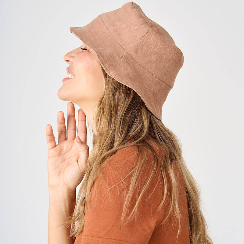
Why Advika Chooses Timeless, Grounded Colors Over Seasonal Trends
The color of the season is here. Again.
Every few months, the fashion world announces the next big color.
One season it’s cobalt blue. Then it’s butter yellow. Then tomato red. Then suddenly everything is purple, followed by green, followed by some very specific shade of beige that apparently wasn't the same beige we were wearing six months ago.
We love color. We really do.
But at Advika, we’re not particularly interested in telling you that the sweater you bought last year is suddenly “out.”
Instead, we prefer colors that have a little more staying power.
Our palette is built around grounded neutrals, earthy colors, muted shades, and natural tones—colors that feel good to wear today, next year, and hopefully for many years after that.
Because your closet shouldn't need a seasonal reset.
We Have Nothing Against Trends. We Just Don't Want to Chase Them.
There is something fun about seeing a completely unexpected color take over fashion.
And honestly, some trends are worth having a little fun with.
But there is a difference between enjoying a color and building an entire wardrobe around whatever the fashion industry has decided is important this season.
Color trends move quickly. The clothes in your closet don't have to.
At Advika, we’re interested in the second one.
When we choose a color, we ask ourselves a different question:
Will you still want to wear this when the trend cycle has moved on?
That question has led us toward a palette of warm browns, soft neutrals, muted greens, dusty blues, earthy reds, mauves, and other colors that don't demand attention simply because they're new.
They earn their place because they're easy to live with.
We Don't Think Neutral Means Boring
When you hear the word neutral, you might think beige.
But neutrals can have a lot more personality than that.
Pebble has a subtle warm-gray quality. Shale is deeper and has blue undertones. Seashell is soft and light with more of a gray undertone than a creamy one. Mink has a touch of gray beneath its soft mauve warmth.
None of these colors are screaming for attention.
And that's exactly the point.
They give the rest of your wardrobe somewhere to go.
A neutral doesn't have to disappear. It can be the piece that makes everything else work.
We Look to Nature More Than the Runway
A lot of our favorite Advika colors could probably be found outside our studio.
Cacao looks like rich earth and dark chocolate. Whiskey brings to mind warm wood and autumn pumpkin spice. . Eucalyptus and Sage feel connected to foliage. Bluebell and Steel Blue have the richness of a deep sky. Mahogany brings warmth and depth, while Pebble and Shale echo stone and weathered surfaces.
These are colors that already exist around us.
They're familiar without being predictable.
And because they come from the natural world rather than a particular fashion moment, they tend to feel less tied to one specific season.
That matters when you're building a capsule wardrobe or simply trying to buy fewer pieces that work harder.
It's also part of what we love about creating elevated basics that can move easily through your wardrobe rather than being tied to one particular moment.
The Secret Is in the Undertones
One of the reasons our colors work so well together is that they're not simply chosen because they “look nice.”
The undertone matters.
Take Shale. At first glance, it's a deeper gray. Look closer and you'll notice the blue underneath it.
Mink has a soft mauve undertone that gives it more depth than a straightforward grey, which works well with Ube, and Moonscape Mauve.
Cacao is deep and rich, which is why it works particularly well with other richer browns, Mahogany, Raspberry, Bluebell, and Whiskey.
And then there's Seashell, one of those wonderfully useful neutrals that can move almost anywhere in the palette.
This is where color gets interesting.
It's not just about whether two colors are technically “matching.” It's about how their undertones speak to each other.
Color Combinations We Keep Coming Back To
Our palette isn't designed so that everything matches everything.
That would be boring too.
Instead, we like combinations that have a little contrast or create a natural tonal relationship.
Cacao works beautifully with richer browns, Mahogany, Raspberry, Bluebell, and Whiskey.
Bluebell can create a beautiful contrast with Whiskey, or feel softer alongside Cacao and Shale.
Pebble acts as an easy neutral with Ivory, Biscotti, Raspberry, brown tones, and Shale.
Shale, with its subtle blue undertone, looks especially beautiful with Bluebell, Ivory, Biscotti, Cacao, and other blue shades.
Mink takes on a softer personality when paired with Ube, Moonscape Mauve, Ivory, Biscotti, or Raspberry.
And Ivory, Biscotti, and Seashell are the kinds of colors that make getting dressed considerably easier because they can move between so many different color families.
That's intentional.
A Wardrobe Shouldn't Have an Expiration Date
This is probably the biggest reason we choose a more grounded color palette.
We want you to be able to buy an Advika piece today and still love it when a completely different set of fashion color trends takes over.
That's an important part of our approach to slow fashion.
For us, slow fashion isn't only about buying less. It's also about creating elevated basics that make you want to keep wearing what you already own.
For us, slow fashion isn't only about buying less. It's also about creating clothing that makes you want to keep wearing what you already own.
A beautiful color can do that.
When a new piece works with something you've had for two, three, or five years, it becomes part of your wardrobe instead of becoming another item that eventually gets pushed to the back of the closet.
That philosophy is also at the heart of our Made in Montreal approach to clothing—making thoughtful pieces in small batches that are designed to stay in your wardrobe, rather than being replaced every season.
You Don't Have to Dress Like the Trend Report
And this is where we think fashion gets a little too serious.
You don't need to wear the “right” color.
You don't need to replace your wardrobe every season.
And you certainly don't need to decide that you suddenly hate a color because someone declared it yesterday's trend.
If you love bright pink, wear bright pink.
If cobalt blue makes you happy, go for it.
If you have been wearing the same beautiful brown sweater for eight years and have no intention of giving it up, we support that too.
Our goal isn't to tell you what color you should wear.
It's to create timeless women's clothing in colors that give you options.
Color That Stays With You
Advika's color palette will continue to evolve. We'll introduce new shades, experiment with different combinations, and occasionally fall in love with a color we simply can't resist.
But the foundation will remain grounded.
Earth, soft neutrals that are muted and calm.
Colors that don't need to be the trend of the moment to be beautiful.
Because maybe the best color isn't the one everyone is talking about right now.
Maybe it's the one you keep reaching for.
The one that works with the rest of your closet.
The one that still feels like you next season.
And the one you don't have to throw out just because the fashion world has found a new favorite.
That's the kind of color we want at Advika.
Less “this is the color of the season.”
More “I’m going to wear this for years.”